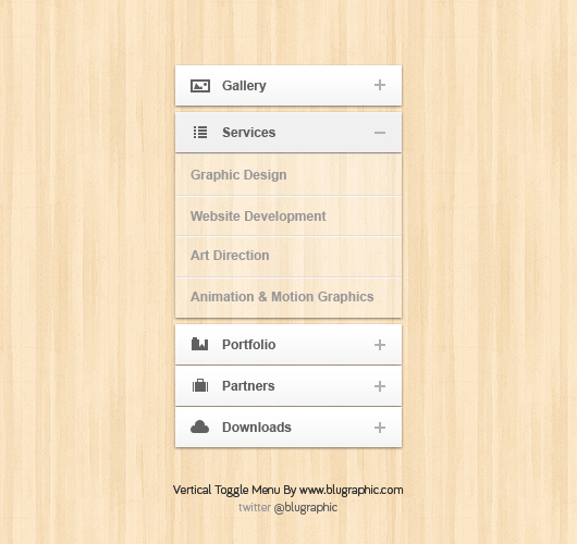
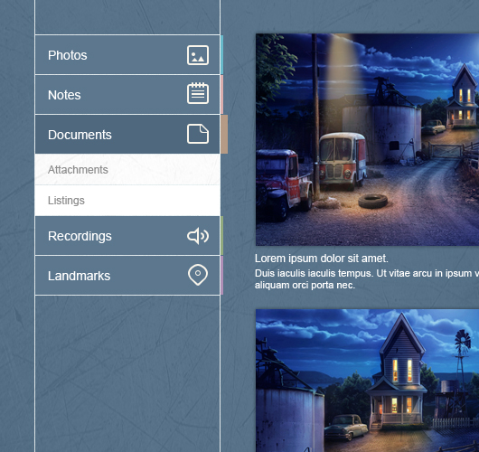
Today, your free item is clean white toggle menu on a wood background.
The menu has a vertical direction, just like most of toggle menus presented out there on the web. You must have notices some of the new modern websites who uses vertical toggle menus, specially blogging ones. I personal love vertical menus, and prefer them over horizontal ones although they take much more space. But visually, they look nice. In today’s web design and specially wordpress themes, you can find this kind of menu a lot. You must have noticed that even my blog, this one you are on has a vertical menu but the only difference in this menu is that it slides. So you’ve got an advantage over me for your blog.
Menu Description :
The menu has a clean elegant white color to make it compatible with most of the website layouts. I even tried it on a dark background it it looked just fine.
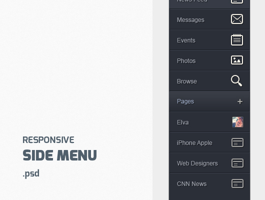
Each menu button has a corresponding icon beside it for the first level, however i choose not to put icons for the second level buttons.
When you press on a menu button, there is a plus icon the transform to minus to help the user know where he stands on your menu.
The opened panel is a transparent one where you can see a little of the background and this creates another nice striking effect.
Enjoy 🙂
33,872 views